The Cartographic Quest for Historical Accuracy: Aiming to Represent Earth at its “True Scale”
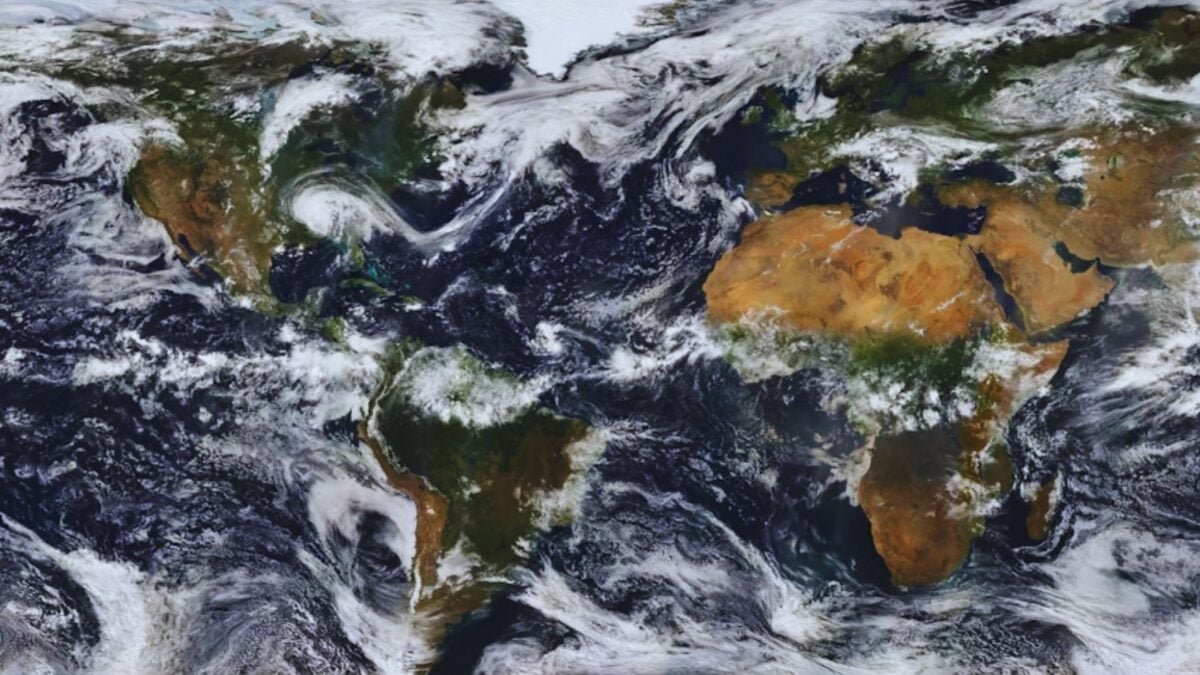
For centuries, humanity has learned geography with maps that distorted the proportion of continents. Africa, the second largest continent, appeared reduced compared to Europe and North America. Now, Equal Earth proposes a different view: a world map that corrects these historical inequalities and opens a new debate on how we represent the world.
### Equal Earth: cartography that challenges tradition

Equal Earth was born in 2018 by cartographers Bojan Šavrič, Tom Patterson, and Bernhard Jenny, with a clear purpose: to represent countries and continents according to their real surface area. Compared to the Mercator projection, which exaggerates high latitudes and minimizes the size of regions like Africa or South America, Equal Earth restores proportion to a map that seeks to be fairer and more realistic.
The initiative has received significant support: the National Geographic Society, convinced that this map more faithfully shows the magnitude of the continent, has given its official support and even promotes the Equal Earth Project, which seeks a global change in the way geography is taught and perceived.
### Free and accessible cartography for everyone

One of the most striking elements of Equal Earth is its accessibility. The map is in the public domain, which means that anyone can reproduce it, modify it, or even sell it. Its creators based it on data from Natural Earth, the CIA, and the GEOnet server, and added manual shading along with over 2,600 toponym labels, including disputed areas like Crimea, Western Sahara, or the Ilemi Triangle.
There are versions focused on different regions, and its accessibility is total: it is available in multiple formats —from JPEG to SVG— and in various languages, including Spanish. It can even be printed on a large scale, reaching dimensions of 140 × 74 cm and resolutions of up to 350 dpi, equivalent to 19,000 × 10,000 pixels.
### A campaign to change the way we see the planet
Equal Earth goes beyond cartographic aesthetics: it is a commitment to geographic justice. The Correct the Map campaign seeks global institutions like the World Bank or the United Nations to adopt this projection as a reference. The idea is for future generations to learn with a map that does not minimize the importance of entire continents, but shows the planet with equal areas and real proportions.
In this sense, Equal Earth is not just an educational resource; it is also a political and cultural tool that questions centuries of distorted perceptions and opens a global conversation on how we represent ourselves in the space we inhabit.